.avif)
Famoz - Redesign hompage
I redesigned this creative film agency’s website to better reflect the premium quality of their work and strengthen their positioning. I improved the portfolio presentation, optimized the user flow, and built the site in Webflow for performance and scalability.
About The Project
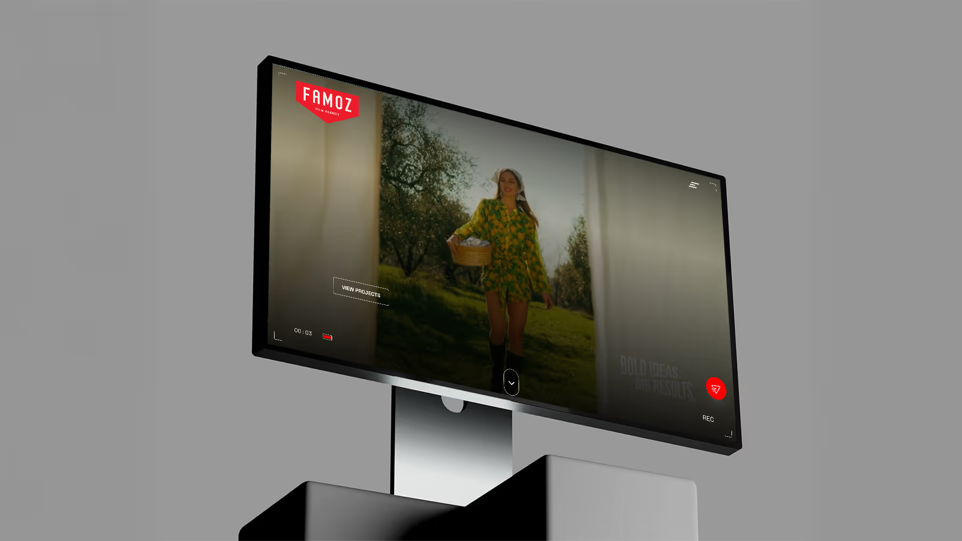
Famoz is a Dutch creative film agency that produces high-quality corporate films, commercials, product videos, and recruitment content for brands. They help businesses tell their story through strategic video production, from concept to final delivery. They needed a redesign to better reflect their premium creative work, showcase their portfolio more effectively, and position themselves as a modern, high-end video partner that matches the quality of the content they produce.
Industry
Creative Film & Video Production
Services Provided
Web Design, UX Strategy, Web Development
Timeline
4–6 Weeks
Platform
Webflow
Tools Used
Relume, Figma, Webflow
The Challenge
Before the redesign, the website wasn’t effectively converting visitors into inquiries or qualified leads. The design felt inconsistent, with no clear visual hierarchy to guide attention, and the messaging didn’t strategically move users toward action. There was no strong or well-positioned CTA to capture intent, and the mobile experience created friction through layout and usability issues, leading to missed engagement and lost opportunities.

Strategy & Approach
🎯 UX Improvements
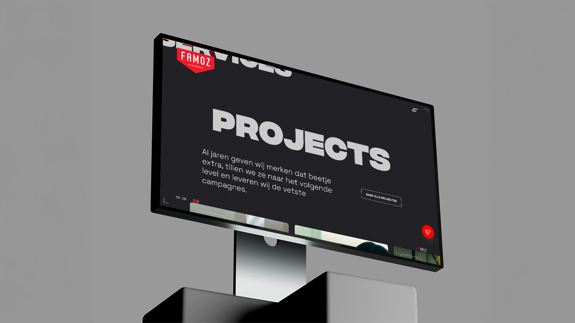
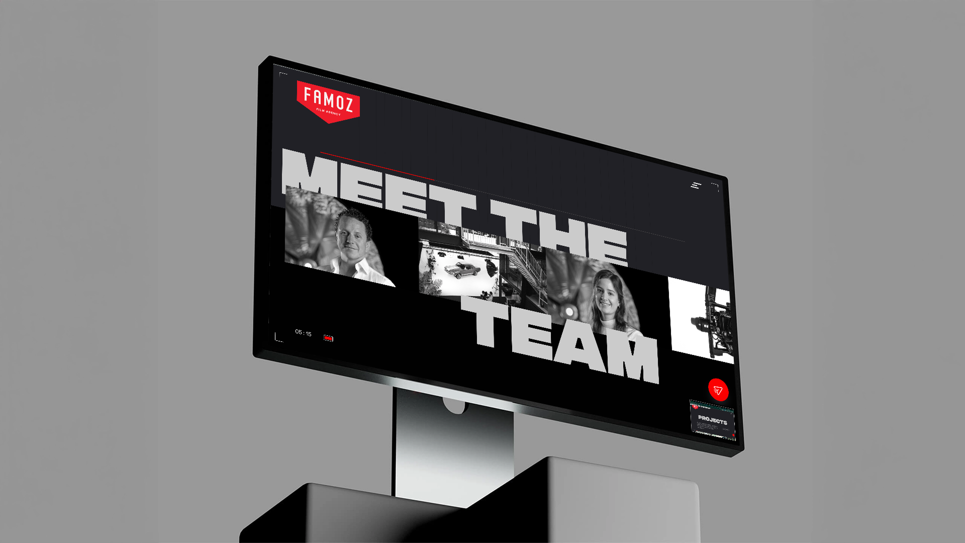
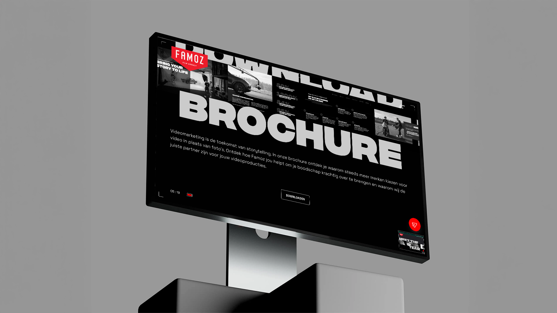
I started with research to understand the target audience, their intent, and where friction existed in the current experience. Through strategic wireframing, I restructured the site architecture, clarified the user journey, and created a logical flow that guides visitors naturally from awareness to action. Every section was designed with purpose, ensuring users always know where they are and what to do next.
🎨 Visual Redesign
The previous design lacked consistency and hierarchy, which weakened the brand perception. I introduced a refined visual system with stronger typography, spacing, and layout principles to create a premium, cohesive look that matches the quality of their creative work. The result is a modern, confident interface that builds trust within seconds.
📈 Conversion Optimization
Conversion was a core focus throughout the process. I developed a clear CTA placement strategy based on user intent, positioning calls-to-action at key decision points across the page. By reducing friction, strengthening messaging, and aligning design with business goals, the new website not only looks better, it performs better.
Showcase

Results
The redesign led to increased clarity in brand positioning, creating a stronger and more professional market presence. User navigation improved significantly through a simplified structure and clearer content hierarchy, making it easier for visitors to find relevant information.
Call-to-action visibility became more prominent and strategically placed, guiding users toward inquiry and conversion moments. Performance optimizations also resulted in faster loading speeds, contributing to a smoother experience and a more premium brand perception overall.
If supported by data, this translated into measurable improvements such as higher conversion rates, longer time on page, and increased lead submissions reinforcing that the redesign was not just aesthetic, but business-driven.
+32%
conversion increase
+48%
time on page
+25%
lead submissions
%201.avif)